

All Tech is Human
Redesign the visual guideline
All Tech is Human is a non profit organization that unites a diverse range of stakeholders to expand the overall Responsible Tech ecosystem and co-create a better tech future.
Problem
In the original website, the navigation and information hierarchy is unclear and it is not easy to find pertinent information. The color choices appear vivid and playful, delivering a “Humanly” feeling. However, the images and visual styles seems irrelevant to the complex relation between human, technology, and change.
COMMUNICATION GOAL
1. Tell the story in a fun and clear way
2. Capture the relation between tech & human
3. Provoke thoughts on “Change”
Before

After

Moodboard

I ended up choosing the right visual styles:
Constructive Layout that resembles building blocks
Reflective Rewrite rules on a blank paper
Simple Clean color palette
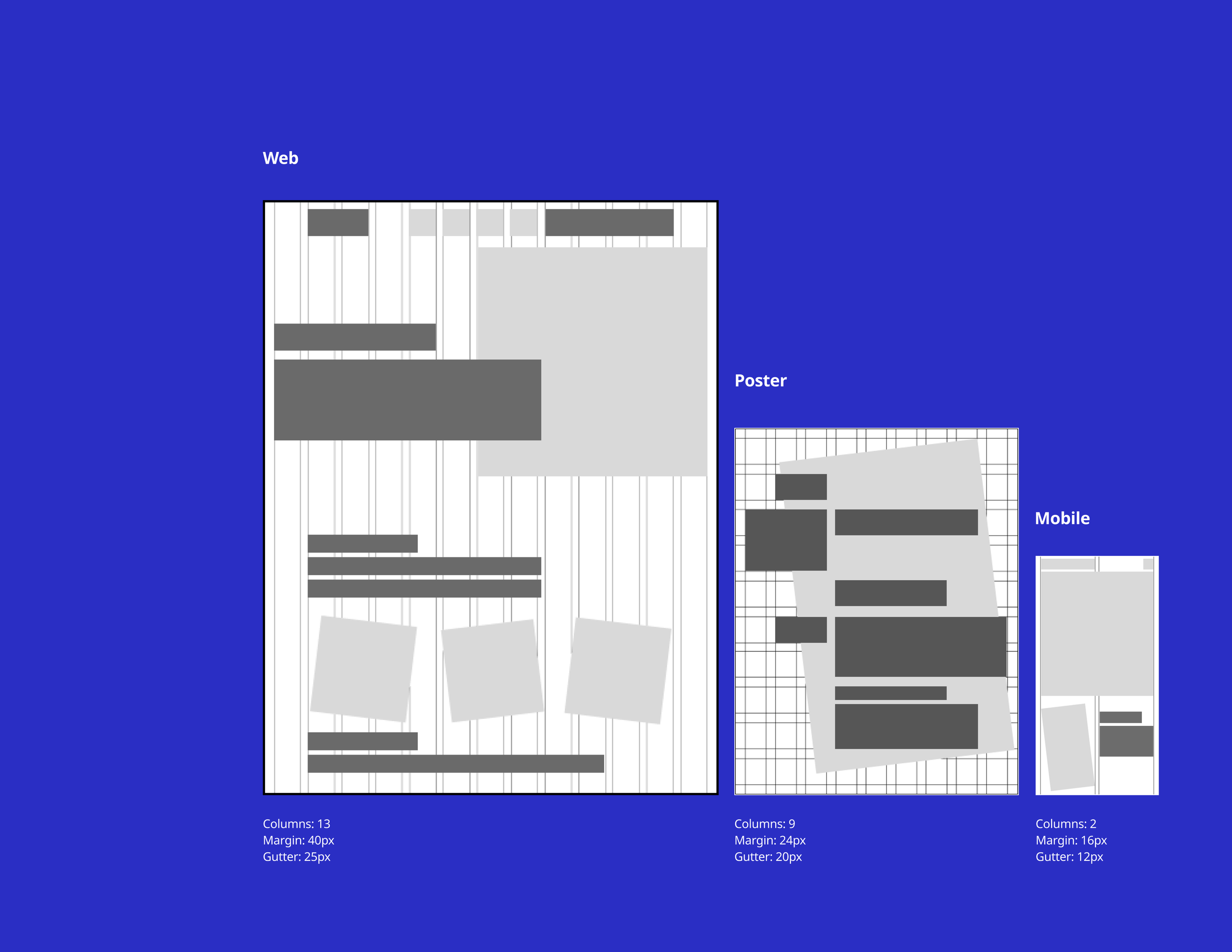
Grid system
The shapes are squares or rectangles of 17 : 10 ratio. For one section, at least one decoration, image or background shape is rotated 6.8 or -6.8 degrees for variety. The odd number of columns are used for web and poster(13 and 9) for an asymmetric, fun feeling. The mobile grid is simpler and has only 2 columns. This is because to balance the irregular shapes and avoid over complicating the layout.

Typography
EB Garamond: Human
EB Garamond is a humanist typeface. Letters with relatively organic structure resembling handwriting with a pen but slightly more structured and upright.
Noto Sans: Tech
Noto sans provides a modern vibe. The extensive language support corresponds with the diverse technology practitioners.

Color
The primary colors are analogous colors to establish contrast. The overall cool tone creates a simple and soothing vibe. The strongly saturated blue makes the design bold & vivid while the pale pink balances it out with more human & soft feeling.

Imagery
All images should include one or a group of people in them to create a human-centered atmosphere. The saturation is adjusted to black and white. A screen layer of primary blue is applied to create a consistent visual. When hovering, the real color reveals, resembling creating changes.


Redesign
Web - Home

Web - Podcast

Mobile - Home
